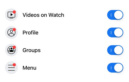
Enough of all those annoying red dots appearing in Groups, Watch or other Tabs on Facebook. Too much of it can actually trigger anxiety. You might soon see a lot less of the hue on Facebook.
The social media giant is testing is the ability to turn off the crimson in-app notification dots that seem to pop up every time you check Facebook on your phone. This will make Facebook more user friendly without any form of disturbance whenever you open the app.

The bright red dots (officially known as badges) appear on the mobile app’s home screen, perhaps to alert you of a new video or new activity in one of your groups. Occasionally the alerts are redundant; popping up for a video you’ve already seen.
According to Facebook, “It’s related to the work we’re doing with the well-being team. We’re thinking about how people spend their time in the app and making sure that it’s time well spent” a Facebook spokesperson confirms to TechCrunch .
The feature has started testing on a subset of iOS and Android users. To find out if you are part of the test;
How to Turn Off Facebook Notification Dot
Go to the “Settings and Privacy” section of your Facebook mobile app. Tap on “Settings” and then scroll down to “Notifications”. You should see a heading that says “Notification Dots” at the very bottom, and that will lead you to a toggle menu where you can choose which type of badges you no longer want to see.
Unfortunately, not everybody at the moment will be able to test this feature. You might be lucky to be part of the early test users.
Notification batches are very important to Facebook, as it is one of the major ways the social media giant keep users glued to the platform. You can call it objective distractions.

Never experienced this before side I’m not really a fan of Facebook anymore
This is a welcome development. They should roll it out globally, enough of all those annoying, distracting red tag dots.
Good For Them. It’s Good To Think Of Users Experience While Using Your App. Thank You For Taken This Step Facebook.
This will come in handy
Nice development
People like me hates that red dots ehen
I only care about notifications dot. It tells when someone commented on ur post or mentioned ur name and others.
Hope dy will extend d feature to lite version